
Case Study: Ceru Restaurants
It may surprise you to know that it is very cost effective for you to upgrade to the very latest responsive design on your website. Here are some examples of what it can do for you.
Ceru is Levantine Restaurant sourcing ingredients locally in the UK as well as from across the Levantine region encompassing Cyprus, Turkey, Lebanon and Israel.
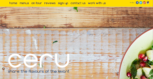
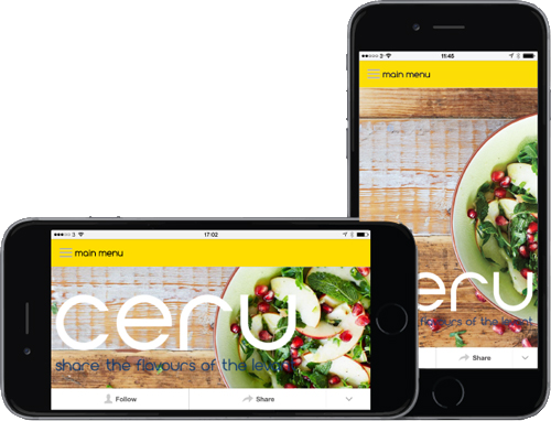
We built a site for Ceru to really capture the fresh and fantastic nature of the food and atmosphere that their trendy pop up restaurant creates. Typically nowadays we design three variations of the site: Desktop, Mobile and Tablet for our clients, to enhance aesthetics but also for a greater usability and experience the viewers.
A simple fresh design can often be more effective than a complex site filled with information. It allows viewers to navigate around the site freely, allowing them to explore rather than being bombarded and confused.
We design each of our sites responsive, meaning it will be different on every platform but with the same domain name due to clever css we programme in. Adapting to its device the site will change its functionality and asthetics to perform and increase usability to the maximum possible potential.
The Real Importance of 'Mobile Friendly' Sites
How having a mobile site can benefit your business
There are obvious advantages to having a mobile-friendly design but perhaps the most important aspect is not so obvious. Search Engine Optimisation (SEO) is a prerogative for any business.
In the past, mobile sites with different URL's were used, for example twitter had the domain “m.twitter.com” where the “m” signified a totally separate site for mobiles. Nowadays it is imperative for any business to nudge yourself further up the Google ratings. However, not having a mobile site won't demote your rating, on the contrary, Google actually prefers responsive sites which use the same URL but display differently for each device. Google will in fact promote your site, often boosting it to the top.
With all of our sites we follow Google recommendations and create responsive designs using clever css coding instead of html to change how the page is rendered on the device.
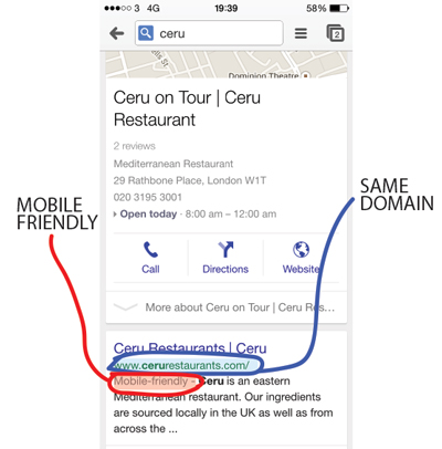 As you can see from this search on a mobile phone, just for the word Ceru, it appears straight at the top of the page with the very first result for the website.
As you may notice it has kept the same domain name as the desktop version, but straight underneath Google has added in the words 'Mobile Friendly.' This is a clear example that google actually looks for sites that have responsive designs and promotes them to the top of their results page.